Welcome to another exciting chapter in your Flutter development journey! Whether you’re just starting out or are well on your way to mastering the art of building beautiful apps, buttons are a fundamental part of the user interface that you’ll work with often.
In this post, we’re going to take a deep dive into the world of buttons in Flutter. We’ll explore the different types of buttons available, how to customize them to make your app stand out, and some practical examples you can implement right away. Let’s jump in and explore how you can make your Flutter buttons both functional and visually stunning!
LIST OF BUTTONS IN FLUTTER
2. TextButton
3. IconButton
4. OutlinedButton
5. DropDownButton
6. PopupMenuButton
7. FloatingActionButton
8. ToggleButtons
9. RawMaterialButton
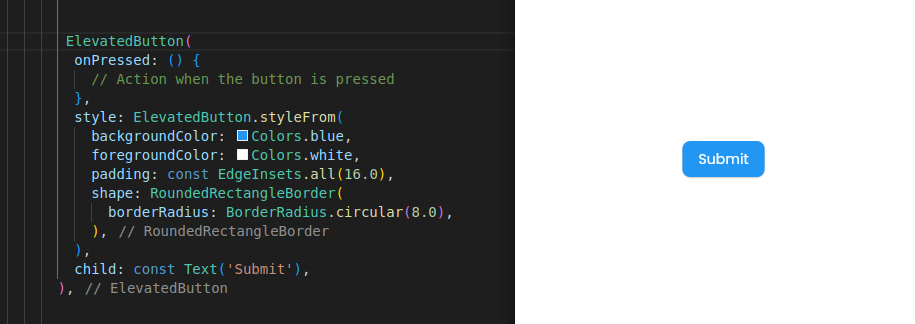
Elevated Button
An elevated button is a material design button with a shadow that provides a 3D effect. It is typically used for primary actions that need to stand out.
Main Properties:
> onPressed: Callback function that is called when the button is pressed.
> style: Customizes the button’s appearance, such as background color, elevation, shape, etc.
> child: The widget displayed inside the button, usually text or an icon.
Use Cases:
> Primary actions like submitting a form, saving data, or proceeding to the next step in a process.
> Buttons that need to be visually prominent and attract user attention.

Text Button
A text button is a flat button without a background, making it less prominent than elevated buttons. It is used for secondary or less critical actions.
Main Properties:
> onPressed: Callback function that is called when the button is pressed.
> style: Customizes the button’s appearance, such as text color, padding, etc.
> child: The widget displayed inside the button, usually text.
Use Cases:
> Secondary actions like “Cancel” or “Skip” that do not need to draw as much attention.
> Buttons used in dialogs, menus, or other places where you need a less prominent action.

Icon Button
An icon button is a button that displays an icon instead of text. It is often used for quick actions or when screen real estate is limited.
Main Properties:
> icon: The icon displayed inside the button.
> onPressed: Callback function that is called when the button is pressed.
> color: Color of the icon.
> iconSize: For adjusting Size of the icon.
Use Cases:
> Actions like “Like”, “Share”, or “Settings” where an icon is more appropriate than text.
> Toolbar actions or app bars where space is limited.

OutlinedButton
An outlined button is similar to a text button but with a border outline. It is used for actions that need a bit more emphasis without being as prominent as an elevated button.
Main Properties:
> onPressed: Callback function that is called when the button is pressed.
> style: Customizes the button’s appearance, such as border color, text color, padding, etc.
> child: The widget displayed inside the button, usually text.
Use Cases:
> Secondary actions that need to stand out slightly more than text buttons.
> Buttons used in forms or settings where the action is important but not the primary focus.

DropDownButton
A dropdown button shows a menu of options when pressed, allowing the user to select one. It is useful for selecting from a list of options.
Main Properties:
> value: The current selected value.
> onChanged: Callback function that is called when a new value is selected.
> items: List of DropdownMenuItem widgets to display in the dropdown menu.
Use Cases:
> Selecting from a predefined list of options, such as choosing a country, language, or category.
> Situations where space is limited and you need to provide multiple choices.

PopupMenuButton
A popup menu button shows a menu when pressed, allowing the user to choose from a list of options. It provides a more complex menu than DropdownMenuButton.
Main Properties:
> onSelected: Callback function that is called when a menu item is selected.
> itemBuilder: Function that builds the menu items.
> child: The widget displayed as the button, often an icon or text.
Use Cases:
> Providing a list of actions or options, such as “Sort”, “Filter”, or “More Options”.
> When you need a more complex menu than a simple dropdown.

FloatingActionButton
A floating action button (FAB) is a circular button that floats above the content. It is used for the primary action on a screen and is typically positioned at the bottom right.
Main Properties:
> onPressed: Callback function that is called when the button is pressed.
> backgroundColor: Background color of the button.
> child: The widget displayed inside the button, usually an icon.
Use Cases:
> Primary actions like “Add”, “Compose”, or “Create” that are crucial for the user.
> Prominent actions that need to be easily accessible throughout the app.

ToggleButtons
oggle buttons allow users to select one or more options from a set of buttons. They are used for multiple selection scenarios.
Main Properties:
> isSelected: A list of booleans representing the selection state of each button.
> onPressed: Callback function that is called when a button is pressed.
> children: The list of widgets to display as buttons, typically icons or text.
Use Cases:
> Multiple selection options, such as filtering or formatting options.
> Situations where users need to choose from a set of options where multiple selections are allowed.

RawMaterialButton
A RawMaterialButton provides a way to create highly customizable buttons with minimal styling. It requires manual styling and configuration.
Main Properties:
> onPressed: Callback function that is called when the button is pressed.
> fillColor: Background color of the button.
> padding: Padding around the button’s child.
> shape: Defines the shape of the button.
> elevation: Shadow elevation of the button.
> child: The widget displayed inside the button.
Use Cases:
> When you need complete control over the button’s appearance and behavior.
> Creating custom buttons with specific visual treatments.


