When building mobile applications, one of the most important considerations is ensuring that the app looks and performs well on various screen sizes and orientations. Flutter is a great framework for developing cross-platform apps, but responsive design in Flutter requires some attention to detail.
In this blog post, we will dive into how to create responsive Flutter apps that automatically adjust to different screen sizes, resolutions, and orientations. You will learn the key strategies and techniques that will help you build responsive, adaptive, and fluid UIs for your Flutter apps.
Why Is Responsive Design Important in Flutter?
Responsive design is the practice of creating UIs that adapt and scale based on the device’s screen size and resolution. This is crucial because:
- Diverse Screen Sizes: Smartphones, tablets, and even foldable devices come in various sizes. Your app should look good and function properly on all of these devices.
- Orientation Changes: The device can be in portrait or landscape mode, and the layout needs to adapt to these changes smoothly.
- Pixel Density: Devices come with different pixel densities (DPI). Without a responsive layout, your app may look too stretched or too compact on different devices.
- User Experience: A responsive design ensures a consistent and pleasant experience across all screen sizes, preventing usability issues.
Flutter offers several tools and widgets to make your app responsive, and we’ll explore these in depth.
Key Concepts for Responsive Design in Flutter
Before we jump into the practical strategies, let’s first understand a few fundamental concepts that will help us build responsive designs in Flutter.
Screen Size and Resolution: The physical dimensions of the device and its pixel density (DPI) influence how the app is rendered on the screen. The size is typically measured in inches, while the resolution is measured in pixels (PPI).
Aspect Ratio: Aspect ratio defines the relationship between the width and height of the screen. Different devices may have different aspect ratios, which is something you should consider when designing layouts.
Density-Independent Pixels (dp): Flutter uses logical pixels for designing layouts. The actual pixel size of a logical pixel depends on the device’s screen density (DPI). Flutter handles this automatically, but it’s important to keep this in mind.
MediaQuery: A Flutter widget that provides information about the screen’s size, resolution, and orientation. It’s essential for adjusting the layout dynamically based on the screen’s properties.
LayoutBuilder: A widget that allows you to build different layouts based on the available screen space. It provides the constraints passed to the widget tree.
Building Responsive Flutter UIs
Now let’s dive into how you can create responsive layouts in Flutter using different tools and techniques.
1. Using MediaQuery
MediaQuery is one of the most common ways to create responsive layouts. It provides information about the device’s screen size, orientation, and pixel density. You can use MediaQuery to adjust the layout dynamically.
Here’s a simple example of how to use MediaQuery:
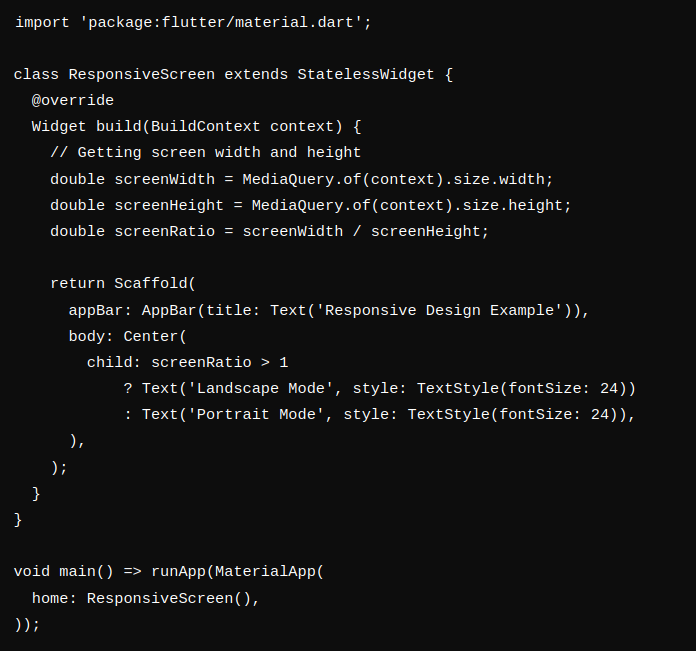
In this example, the layout adjusts the text based on whether the device is in landscape or portrait mode using the screenRatio (width divided by height).
2. LayoutBuilder
LayoutBuilder helps you define different layouts depending on the available space. It passes the constraints of the parent widget to the builder function, allowing you to build a responsive layout accordingly.
Here’s an example:
import ‘package:flutter/material.dart’;
class ResponsiveLayout extends StatelessWidget {
@override
Widget build(BuildContext context) {
return Scaffold(
appBar: AppBar(title: Text(‘Responsive Layout with LayoutBuilder’)),
body: LayoutBuilder(
builder: (context, constraints) {
// Check if the screen width is smaller than a certain threshold (600 pixels)
if (constraints.maxWidth < 600) {
return Column(
children: [
Text(‘Mobile Layout’, style: TextStyle(fontSize: 24)),
Icon(Icons.phone_android, size: 50),
],
);
} else {
return Row(
children: [
Expanded(child: Text(‘Tablet/Desktop Layout’, style: TextStyle(fontSize: 24))),
Expanded(child: Icon(Icons.desktop_mac, size: 50)),
],
);
}
},
),
);
}
}
void main() => runApp(MaterialApp(
home: ResponsiveLayout(),
));
In this example, we use LayoutBuilder to check the available screen width. If the screen is small (like a phone), we display a Column. Otherwise, we switch to a Row for tablets and larger screens.
3. Flexible and Expanded Widgets
The Flexible and Expanded widgets are great for making your UI responsive. They let you create flexible layouts that scale according to the available space.
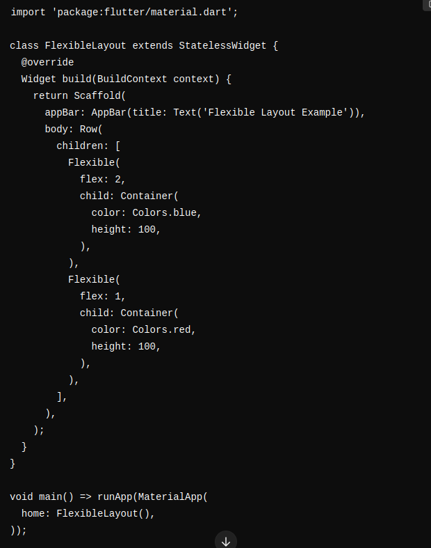
In this case, we have two Flexible widgets. The first one takes twice as much space as the second one, ensuring that the layout adapts to various screen sizes.
4. Using the AspectRatio Widget
The AspectRatio widget helps you maintain the aspect ratio of your widget regardless of the screen size. This is useful when you want to display a consistent layout element, like an image, that maintains a specific ratio.
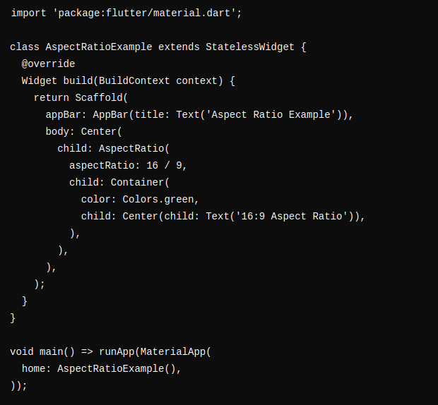
Here, the container maintains a 16:9 aspect ratio regardless of the screen size.
5. Responsive Images
To ensure your images look good on different screen sizes and resolutions, use the Image.asset or Image.network widgets with different resolutions. Flutter automatically selects the best resolution based on the screen’s pixel density, but you can manually define it.
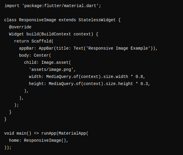
In this example, the image scales based on the screen width and height.
Tips for Building Responsive Flutter Apps
Use a
ContainerwithPaddingandMargin: To adjust space around your widgets, you can use padding and margin dynamically based on screen size.Avoid Hard-Coded Widths and Heights: Instead of specifying fixed values for widths or heights, use percentage-based values or flexible widgets.
Test on Different Screen Sizes: Test your app on a variety of devices (phone, tablet, desktop) to ensure it looks good on all screen sizes.
Use Themes for Consistency: A consistent theme across devices ensures a smooth user experience. Define your app’s color scheme, fonts, and button styles in a global theme.
Consider Navigation: On smaller screens (like phones), use bottom navigation bars, while on larger screens (like tablets or desktops), you can consider using side drawers or tabs.


